I started teaching Data Journalism and Visual Journalism at the School of Journalism, HU University of Applied Sciences, Utrecht (NL).
The COVID-19 pandemic gave data journalism an incredible boost. The Corona-virus provided us with interesting data stories and new data visualizations in the fields of healthcare, epidemiology and virology.
I find it important to teach the development of data visualization in a historical context.
Nowadays the data sets are more complex than ever – the visualizations, however, refer to graphics that have their origins more than 150 years ago. Back then, pioneers such as Charles Minard, Florence Nightingale, John Snow and Otto Neurath developed unique methods of data collection and new data visualizations that we still use today.
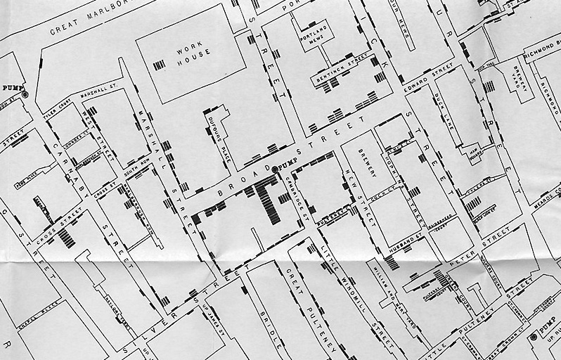
1854
Mortality during the cholera outbreak in London
During the cholera outbreak John Snow (1813-1858) developed a method of displaying mortality data on a map.
Map drawing by Charles Cheffins (1807-1861).
Source
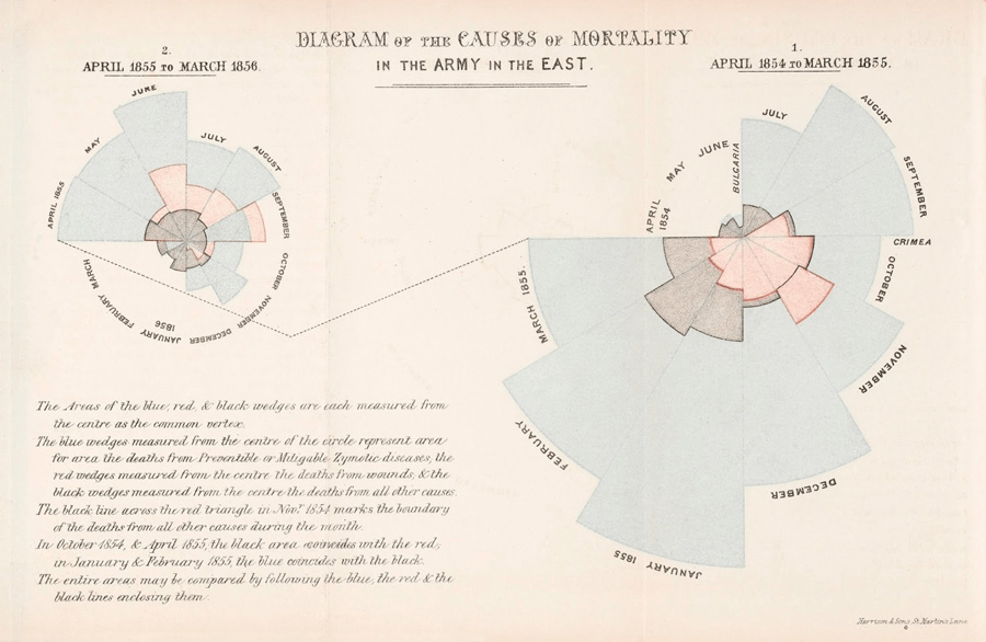
1858
Diagram of the Causes of Mortality in the Army of the East, 1854-1856
Coxcomb chart by Florence Nightingale (1820-1910).
Source
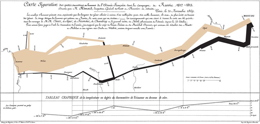
1869
The diminution of Napoleon’s army, during his Russian Campaign 1812-1813
Line chart by Charles Minard (1781-1870).
Source
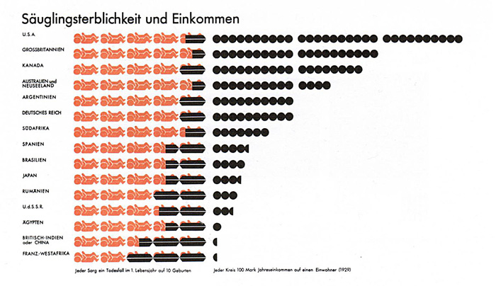
1929
Infant Mortality and Income
Pictorial statistics using ISOTYPE (International System of Typographic Picture Education) by Otto Neurath (1882-1945) and Gert Arntz (1900-1988).
Source
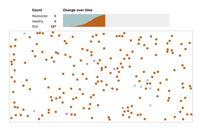
2020
Spread of the Corona-virus: One of different simulations on the spread of the virus among 200 people
Graphics by Harry Stevens, Washington Post.
Source
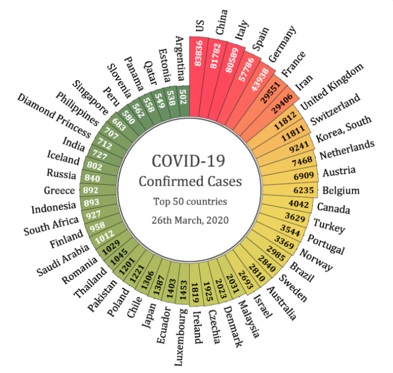
2020
Top 50 countries of confirmed cases of COVID-19
Coxcomb chart, also known as Nightingale rose chart,
by Origin Lab.
Source
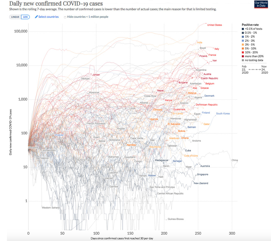
2020
Global COVID-19 Containment: daily new confirmed cases
Interactive line charts by Visual Capitalist and Our World in Data.
Source
2020
Face-mask use in the United States due to COVID-19
Interactive graphics by McKinsey COVID Response Center.
Source